Chris Padilla/Blog
My passion project! Posts spanning music, art, software, books, and more. Equal parts journal, sketchbook, mixtape, dev diary, and commonplace book.
- Access a text file
- Parse it
- Return the results
- Loads of data to render, like blog posts
- A way to query it
- A maximum number per page (the interval at which to show data)
- A way to keep track of which page you're on.
- Content
- API/DB Calls
- Limit value
- Skip value
Sunset Flower
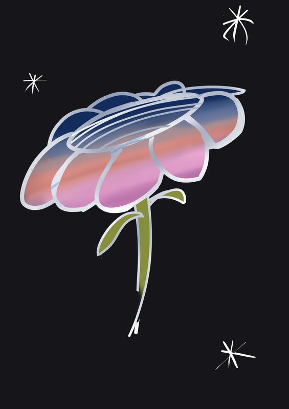
🌅 🌸
Lizalfos

Miranda's least favorite enemy to fight, but my favorite to draw!
Mitigating Content Layout Shift with Next Image Component
One aspect of developing my art grid was moving away from the Next image component and choosing a more flexible option with special css.
There are still plenty of spots on the site I wanted to keep using it, though! This week, I wanted to jot down why.
CLS
Content Layout Shift is something I've written about a few times. Surprisingly, this is my first touch on images, the largest culprits of creating CLS!
A page is typically peppered with images throughout. An image can be wholly optimized to be very lightweight, but can still contribute to a negative user experience if the dimensions are not accounted for.
Say you're reading this blog. And a put an image right above this paragraph. If an image FINALLY loads as you're reading this, all of a sudden this paragraph is pushed down and now you have to scroll to find your place. Ugh.
The Solution
The way to mitigate this is pretty simple: Set dimensions on your images.
Easy if you already know what they are: Use css to set explicit widths and heights. You can even use media queries to set them depending on the screen size.
It gets a little trickier if you're doing this dynamically, not knowing what dimensions your image will be. The best bet, then, is to set a container for the image to reside in , and have the image fill the container. Thinking of a div with an img child.
Next Image Component
It's not too involved to code this yourself, but Next.js comes out of the box with a component to handle this along with many other goodies. The Image Component in Next offers Size optimization for local images and lazy loading.
Here I'm using the component for my albums page
import React from 'react';
import Image from 'next/image';
import Link from 'next/link';

const MusicGrid = ({ albums }) => {
  return (
    <>
      <section className="music_display">
        {albums.map((album) => (
          <article key={album.title}>
            {/* <Link href={album.link}> */}
            <Link href={`/${album.slug}`}>
              <a data-test="musicGridLink">
                <Image src={album.coverURL} width="245" height="245" />
                <span>{album.title}</span>
              </a>
            </Link>
          </article>
        ))}
      </section>
    </>
  );
};

export default MusicGrid;
And here is what's generated to the DOM. It's a huge sample, but you can find a few interesting points in there:
The key pieces being the srcset used for different sized images generated for free. These are made with externally sourced images, interestingly enough, but they're generated by the component to handle rendering specifically to the page!
<article>
<a data-test="musicGridLink" href="/forest"
><span
style="
box-sizing: border-box;
display: inline-block;
overflow: hidden;
width: initial;
height: initial;
background: none;
opacity: 1;
border: 0;
margin: 0;
padding: 0;
position: relative;
max-width: 100%;
"
><span
style="
box-sizing: border-box;
display: block;
width: initial;
height: initial;
background: none;
opacity: 1;
border: 0;
margin: 0;
padding: 0;
max-width: 100%;
"
><img
style="
display: block;
max-width: 100%;
width: initial;
height: initial;
background: none;
opacity: 1;
border: 0;
margin: 0;
padding: 0;
"
alt=""
aria-hidden="true"
src="data:image/svg+xml,%3csvg%20xmlns=%27http://www.w3.org/2000/svg%27%20version=%271.1%27%20width=%27245%27%20height=%27245%27/%3e" /></span
><img
src="/_next/image?url=https%3A%2F%2Fres.cloudinary.com%2Fcpadilla%2Fimage%2Fupload%2Ft_optimize%2Fchrisdpadilla%2Falbums%2Fforest.jpg&w=640&q=75"
decoding="async"
data-nimg="intrinsic"
style="
position: absolute;
top: 0;
left: 0;
bottom: 0;
right: 0;
box-sizing: border-box;
padding: 0;
border: none;
margin: auto;
display: block;
width: 0;
height: 0;
min-width: 100%;
max-width: 100%;
min-height: 100%;
max-height: 100%;
"
srcset="
/_next/image?url=https%3A%2F%2Fres.cloudinary.com%2Fcpadilla%2Fimage%2Fupload%2Ft_optimize%2Fchrisdpadilla%2Falbums%2Fforest.jpg&w=256&q=75 1x,
/_next/image?url=https%3A%2F%2Fres.cloudinary.com%2Fcpadilla%2Fimage%2Fupload%2Ft_optimize%2Fchrisdpadilla%2Falbums%2Fforest.jpg&w=640&q=75 2x
" /><noscript
><img
srcset="
/_next/image?url=https%3A%2F%2Fres.cloudinary.com%2Fcpadilla%2Fimage%2Fupload%2Ft_optimize%2Fchrisdpadilla%2Falbums%2Fforest.jpg&w=256&q=75 1x,
/_next/image?url=https%3A%2F%2Fres.cloudinary.com%2Fcpadilla%2Fimage%2Fupload%2Ft_optimize%2Fchrisdpadilla%2Falbums%2Fforest.jpg&w=640&q=75 2x
"
src="/_next/image?url=https%3A%2F%2Fres.cloudinary.com%2Fcpadilla%2Fimage%2Fupload%2Ft_optimize%2Fchrisdpadilla%2Falbums%2Fforest.jpg&w=640&q=75"
decoding="async"
data-nimg="intrinsic"
style="
position: absolute;
top: 0;
left: 0;
bottom: 0;
right: 0;
box-sizing: border-box;
padding: 0;
border: none;
margin: auto;
display: block;
width: 0;
height: 0;
min-width: 100%;
max-width: 100%;
min-height: 100%;
max-height: 100%;
"
loading="lazy" /></noscript></span
><span>Forest</span></a
>
</article>Swing Low
Sangin'! With Lucy!
Sleepy Seals

🤫🦭😴
Art Grid in Next.js
A visit to the homepage of this very site on desktop will show the neat instagram-like image grid of my sketches! Now that much of my blog is visual, and since it's been a year of me drawing, it's time to make a nice display for my drawings.

Creating it with my current setup has been interesting! I'll walk you through it, covering extracting the images and piping them through Next's server side handler.
Parsing Markdown
The setup for my blog is through static files. Meaning, every post is a markdown file, with metadata included at the top of the file, and the content following. It looks something like this:
---
title: Snivy & Mareep
tags:
- Art
date: '2023-09-01T10:35:07.322Z'
---
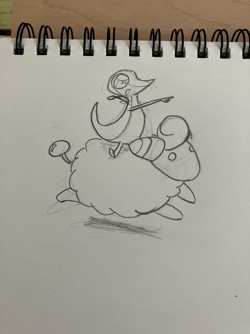
Pokémon — the gateway to doodling on math homework.
...It makes for quick writing and keeps my content portable.
The challenge with this approach, though, is that my images are hosted off site and they are displayed directly through the markdown. A fantastic beginner programmers challenge, if you're ever curios to test out a new language, is to:
I did just that with a few functions:
export const getImageValuesFromMarkdown = (md) => {
  const regex =
    /!\[[^\]]*\]\((?<filename>.*?)(?=\"|\))(?<optionalpart>\".*\")?\)/g;
  return Array.from(md.matchAll(regex)).map((res) => res[1]);
};


export function getAllArtImages(
  fields = ['content', 'slug', 'tags', 'date'],
  options = {}
) {
  const slugs = getPostSlugs();
  let posts = slugs
    .map((slug) => getPostBySlug(slug, fields))
    // Filter false values (.DS_STORE)
    .filter((post) => post)
    // sort posts by date in descending order
    .sort((post1, post2) => (post1.date > post2.date ? -1 : 1));

  const regex = new RegExp('Art', 'i');
  posts = posts.filter((post) => post.tags?.some((e) => regex.test(e)));

  if (options.filter) {
    posts = posts.filter(options.filter);
  }

  if (options.skip) {
    posts = posts.slice(options.skip);
  }

  if (options.limit) {
    posts = posts.slice(0, options.limit);
  }

  const images = [];
  posts.forEach((post) => {
    const postImages = getImageValuesFromMarkdown(post.content);
    postImages.forEach((src) =>
      images.push({
        src: src,
        slug: post.slug,
      })
    );
  });

  return images;
}
getAllArtImages handles a fair amount of logic for getting all of my markdown files, sorting, and only grabbing the attributes I need. That includes only getting posts with the Art tag!
The interesting part here is down in the forEach loop. There, I'm calling getImageValuesFromMarkdown, which uses a regex to find all of the instances of a markdown denotation for an image. In the file, it looks like this:
That all gets massaged into an array of objects with the image source and markdown slug so that the images link to the post.
Displaying Images
From there, it's as simple as calling the method in getServerSideProps() on the page I want to display the grid:
export async function getServerSideProps() {
  const images = getAllArtImages().slice(0, 6);

  return {
    props: {
      images,
    },
  };
}
From there, there's nothing too fancy about it. The react component is simply looping through the images:
import Link from 'next/link';
import React from 'react';

const ArtGrid = ({ images }) => {
  return (
    <>
      <section className="art_display">
        {images.map((image, i) => (
          <article key={image.src} className={`${i > 0 ? 'hideonmobile' : ''}`}>
            <Link href={`/${image.slug}`}>
              <a data-test="musicGridLink">
                <div
                  className="artgridimage"
                  style={{
                    height: '250px',
                    width: '250px',
                    background: 'transparent no-repeat center',
                    backgroundSize: 'cover',
                    margin: 'auto',
                    backgroundImage: `url('${image.src}')`,
                  }}
                />
              </a>
            </Link>
          </article>
        ))}
      </section>
    </>
  );
};

export default ArtGrid;
I'm using the div with a background image set to center the images. Not the most accessible way, but the most-sane way to handle centering images without distorting their aspect ratio.
And that's all there is to it!
Are there tradeoffs to this approach? Why, yes there are! A future concern of mine is for the time when the number of files gets too large, and starts slowing things down. My next step is to take a look into a caching system: Generating the list of images once and saving the results so that this call doesn't happen every time the server receives a request.
A post for another day!
Parkening – Study No. 20
More fingerstyle fun! 🕺👇
Snivy & Mareep

Pokémon — the gateway to doodling on math homework.
ALSO!! Today marks a year of me drawing everyday! If you've ever wanted to give it a whirl, let me tell ya, a lot can happen in a year!
Gurlitt – The Return
Restoring 4 Hearts

We haven't found the recipe for Ice Cream Cookie Sandwiches in Tears of the Kingdom yet!
Strauss - Blue Danube Waltz
Moblin Mask

I just think this Moblin hat in Tears of the Kingdom is swell.
New Blog Layout and Pagination
I've updated my blog home page to show posts in full instead of just the titles. I'm doing too much art and music making to let all that fun stuff hide behind a click!
I also found out I've posted over 200 times to this blog!! A great milestone! And a fun performance issue to navigate with pagination. :)

Pagination
In a big picture sense, you need these things:
That translates to:
Calculating Skip
Skip value is the most interesting value up there. If you have a limit of 5 posts per page, you'll know your starting place if you know what page you're on. Page 1 will shows items 0-4, so there's no skip.
Page 2, however, starts at 5. So we can get this for each page by multiplying the page number minus 1 by 5.
const skip = limit * (page - 1)From there, passing that to the DB will get you just the data you need.
Getting Page State
Plenty of ways to do it, though the most user friendly is likely to keep it in your query params. Your url will look something like /blog?p=2. It has the benefit of allowing users to use the back button on their browser.
Here's how you can get that value in getServerSideProps in Next:
export async function getServerSideProps(context) {
  const page = context.query.p || 1;
  const count = getPostsCount();

  const skip = (page - 1) * 5;
  const allPosts = getAllPosts(
    {
      skip,
      limit: 5,
    }
  );

  return {
    props: { allPosts },
  };
}
context is passed from next with the query params (including any that you set yourself through the [id].js naming convention.) Very handy!
Setting Page State
It's as simple as linking to the new url! First I'll get the current page through the client side router:
import { useRouter } from 'next/router';

export default function Blog({ allPosts, count }) {
  const router = useRouter();
  const query = router.query;
  const currentPage = parseInt(query.p) || 1;
  const lastPage = Math.ceil(count / 5);
And then I can use it in my links below.
<div className="pagination-controller" style={{ display: 'flex' }}>
  <div className="left" style={{ flex: '1' }}>
    {currentPage !== 1 && (
      <Link href={`${router.pathname}?p=${currentPage - 1}`}>Back</Link>
    )}
  </div>
  <div className="right" style={{ flex: '1', textAlign: 'right' }}>
    {currentPage < lastPage && (
      <Link href={`${router.pathname}?p=${currentPage + 1}`}>Next</Link>
    )}
  </div>
</div>
You'll have to do the math to add or reduce a page while ensuring you're not going out of bounds. Above I'm hiding the links based on the calculated lastPage.
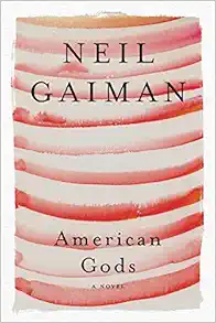
Neil Gaiman on Writing
Several great nuggets of writing insight from Neil Gaiman's introduction to the 10th Anniversary Edition of American Gods.
Like Carl Barks, Gaiman started with a locale:
A couple of weeks later, my editor sent me a mock-up of the book cover. It showed a road, and a lightning strike, and, at the top, it said, “American Gods.” It seemed to be the cover of the book I had planned to write.
I found it both off-putting and exhilarating to have the cover before the book. I put it up on the wall and looked at it, intimidated, all thoughts of ever finding another title gone forever. This was the book cover. This was the book.
Now I just had to write it.
I think about this often, because it feels so true. Each project really does take it's own path:
I remember when it was all done in first draft telling Gene Wolfe, who is the wisest writer I know and has written more excellent novels than any man I’ve met, that I thought I had now learned how to write a novel. Gene looked at me, and smiled kindly. “You never learn how to write a novel,” he told me. “You only learn to write the novel you’re on.”
And then, of course, a great reminder to ship imperfection:
I finished it, eventually, and I handed it in, taking a certain amount of comfort in the old saying that a novel can best be defined as a long piece of prose with something wrong with it, and I was fairly sure that I’d written one of those.
Faber - 100 Degree Blues
Sounds about right down here in Texas 😓